Great User Experiences For All
IndieWeb Carnival: Accessibility in the Small Web
What’s fun about the small, personal web is how unique everyone’s sites are. A website is a space to create, tweak, style, and experiment. But people are also limited by their available time and skills. Some sites are basic while others are flashy. Some sites are easy to use, while others are laid out in unexpected ways. It’s possible to imagine a web where everyone’s site looks the same, but that would be a very different experience. Yes, a social media site like Instagram makes navigating a person’s profile very predictable, but it’s sterile and lacking the personal touch.
However, designing your own page and creating usable experiences is not a trivial task. Big tech companies have whole teams dedicated to optimizing small experiences. But a good user experience is usually not all-or-nothing. Instead, we constantly try to improve things little by little till we reach an experience we think people will be able to use. Sometimes we get feedback about something not working or being hard to use, and so we’ll need to make adjustments. But good UX is a continuum from “completely broken” through “mostly works” to (hopefullY) “extremely easy to use”.
Accessibility is essentially an exercise in creating a good user experience for people with different abilities. An un-named icon button would be confusing for a screen-reader user just like an ambiguous icon might be for a sighted user. An un-focusable region is broken for a keyboard user just like an un-clickable region would be for a mouse user. Some user experience problems are worse than others. The challenge with accessibility is anticipating what the experience would be for someone other than yourself.
In the business world, it can be hard to convince managers that accessibility is worth investing in, despite legal requirements and studies showing the business value. I’d like to think that people in the small web will be a little more eager to make the internet a friendly place for all. Granted, personal websites are often a side project that gets minimal time. But as someone who builds their own website, I can tell you that there’s a sense of pride that comes from obsessing about user experience. Even if only one person out of the handful that land on my site is helped, that’s enough for me.
It’s also worth keeping in mind that improving accessibility often benefits everyone. Have you ever been frustrated by a form where you can’t hit Tab to get to the next text box? Or have you ever struggled to read text on a sunny day due to poor contrast? Those are accessibility concerns that can help everyone.
How to get started improving accessibility
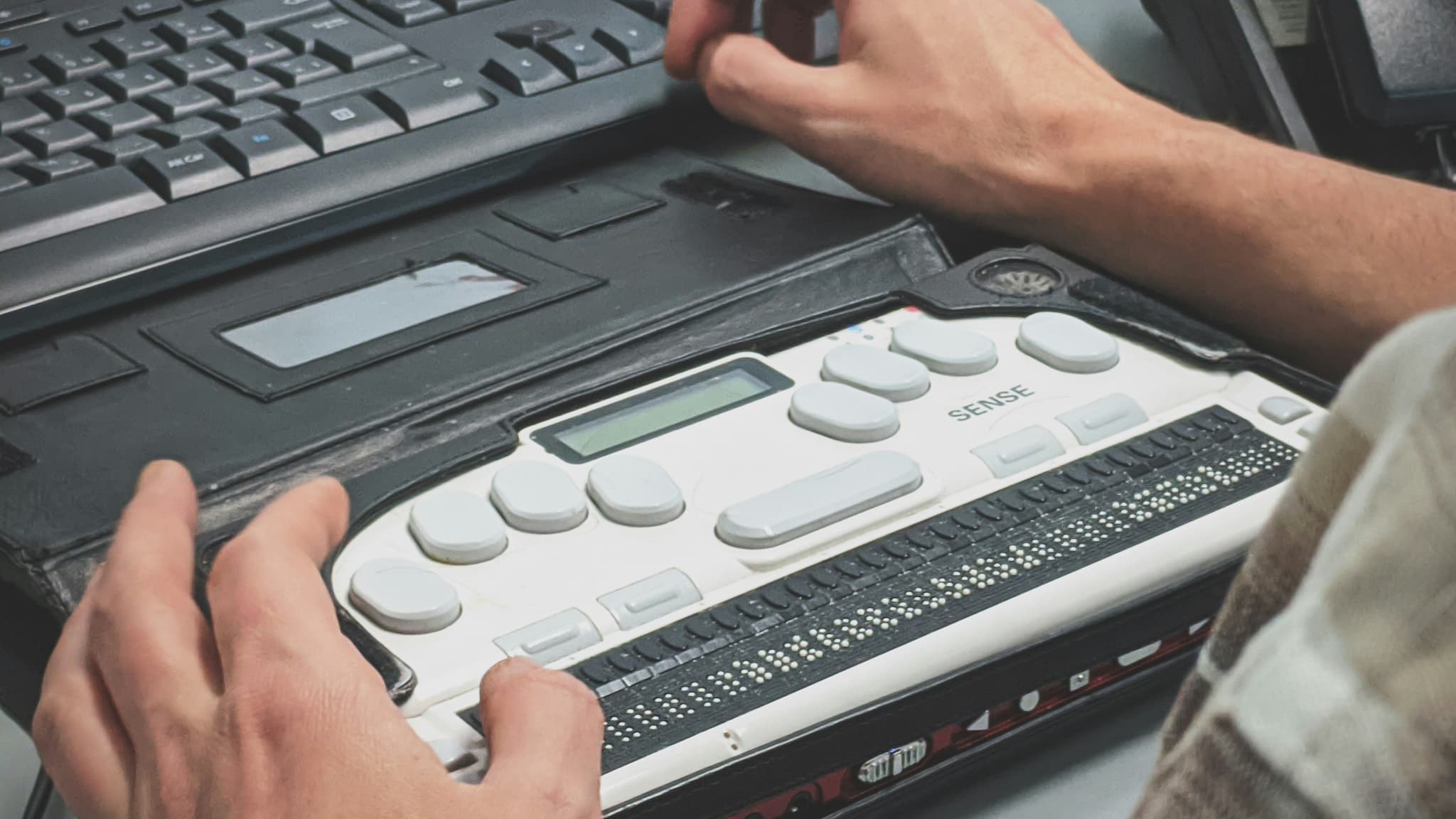
A couple years ago, I took the W3C “Introduction to Web Accessibility” training to learn more about how to make websites accessible to more people. The biggest thing I learned was that there are a wide range of ability levels that people bring to using computers. A blind person using a screen-reader is a common example people think of when defining accessibility. But there are lot of different varieties of visual impalements, from different types of color blindness, to partial vision conditions that may make vision blurry or limit field of view. Then there are different types of motor skills that can impact how quickly/accurately someone can move a mouse, it they even use a mouse at all? There are also the often overlooked cognitive disabilities that can impact what language someone can understand. And even people with the same disability may prefer different tools to access the web so no one’s experience is 100% the same.
While there are many dimensions to accessibility, there is low-hanging fruit that most people can address. The first step is to recognize that people may be using your site differently than you are. Most of the tools to help people access websites rely on interpreting the semantic meaning of page elements (not just the visual elements) so making the meaning of the page clearer to the computer is key. The good news is that most personal sites are often already ahead of corporate sites when it comes to accessible building blocks. I’d recommend checking out an introduction like MDN’s Accessibility guide to get a fuller sense of what it means for websites. But some examples of easier elements of web accessibility to implement include the following.
- Add good image descriptions.
- Choose colors with good contrast
- Never use only color to convey meaning (also use icons or text)
- Make sure icons are accompanied with a label
- Use simple, clear language
- Use semantic HTML like page headings
- Make sure your site is still navigable with 400% font zoom
- Use aria-* attributes only as a last resort
How to start testing accessibility
The best accessibility testing would be to hire an audit by people with a variety of abilities. But there are some basic steps someone can take to improve their site’s accessibility. Here are a few of the approaches I use.
1. Run an automated accessibility test
Use a tool like Lighthouse (built into Google Chrome) or Deque aXe. These are only a starting point and can’t guarantee that your site is user friendly for all. However, these tests can quickly call out common errors or missed opportunities. I have a style guide page which includes a lot of the patterns I use on the site, but it also serves as a great test page for accessibility audits.
2. Check interactive page elements
Use the arrow and Tab keys to navigate your site. You should be able to get to every part of the site using the keyboard. For a simpler site, this is typically not an issue. But if you are using tab-indexes or controlling focus with JavaScript, it’s easy to mess this up.
3. Try a screen reader
I would highly recommend testing your site with a screen reader. I will admit, that these tools take some time to get used to. Consider looking up a tutorial and experiencing what it’s like to navigate by sound. Ideally, you’d test in a range of screen readers, just like browsers historically have had differing levels of compatibility. But using the operating system’s built-in tool should give a sense of what the experience is like.
4. Try an accessibility testing browser extension.
There are a large variety of browser extensions that can help identify, test, and simulate accessibility issues. These tools can help you imagine what different visual impairments might look like. They can also highlight how headings are interpreted, what alt text images have, and other hidden aspects of a webpage that accessibility tools might pick up on.
Conclusion
Diving into the world of “good accessibility” can seem like a deep subject matter, because it is. If you are a company looking to improve access to your site, whether for profit or compliance, I highly recommend hiring an expert. Thankfully, there are some standards and tools that can help point anyone in the right direction. The best people to learn from are those who live with a disability themselves so find other people on the internet who are eager to share their experiences. While it does take some time to learn, everyone can take accessibility into account when publishing websites.
I’m constantly looking to improve my site’s accessibility, so if you have tips please reach out.
This post is a submission to IndieWeb Carnival March 2023 - Accessibility in the Small Web, hosted by orchids for the IndieWeb Carnival.
Responses
-
 💬
blog.basementcommunity.com (mention)
💬
blog.basementcommunity.com (mention)
See how to respond...
Respond via email
If you'd prefer to message me directly, send an email. If you'd also like your message to be visible on the site I can add it as a comment.
Reply via Email
Respond from another site
Responses are collected from posts on other sites. Have you posted somewhere that links to this page? If so, share the link!